Branding Through a Hospitality Lens
- Dala Al-Fuwaires

- May 26
- 8 min read
The strongest concepts today are no longer competing on visual identity alone. They’re competing on memorability.
As visual culture becomes more repetitive, audiences are becoming far more sensitive of when something feels manufactured, trend-driven, or disconnected from the people behind it. The concepts cutting through right now aren’t necessarily the loudest or the most overdesigned. They’re the ones with a strong enough point of view to feel impossible to mistake for anywhere else.
Hospitality has always understood something other industries are now catching up to: people remember how a place made them feel long before they remember the design details themselves. Atmosphere, emotional tone, materiality, branding, and spatial experience all work together to shape that perception.
At House of Form, that thinking informs how we approach branding across hospitality, retail, and lifestyle, whether we’re developing identity alongside interiors or creating standalone brand systems. We believe the strongest concepts are built through clarity of experience, feeling intentional at every scale and across every interaction.
The following projects each take a different approach to branding, shaped by distinct audiences, emotional intentions, and ways of being experienced.
A closer look at how hospitality thinking is influencing the future of brand experience.
LAYMOON
Middle Eastern Cafe & Retail
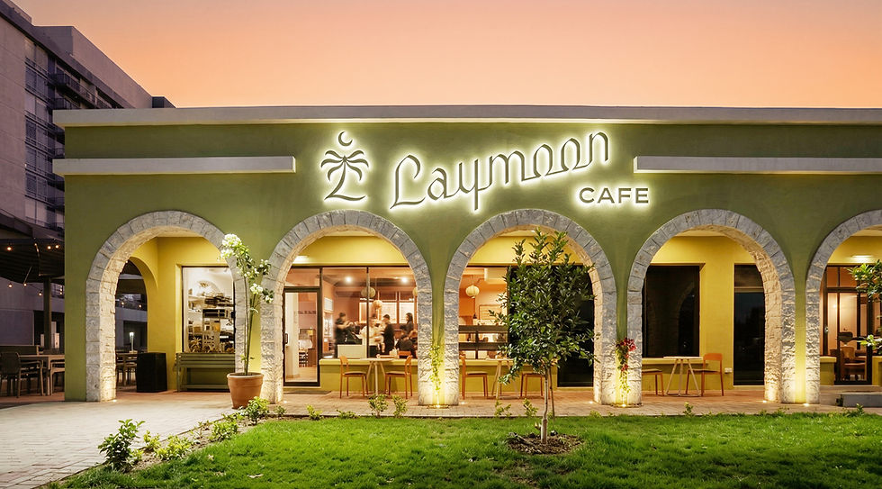


Branding & interior design by House of Form.
When developing the branding for Laymoon, the priority was preserving the cultural authenticity already expressed through both the food and the space itself. The vision was twofold: creating a place that felt nostalgic and comforting for Middle Eastern guests, while also welcoming others into a genuine experience of the owners’ heritage.
From the beginning, the approach focused on “understanding culture rather than defining it,” allowing existing stories, symbols, and architectural references to naturally shape the identity system. Inspiration was drawn from the Keffiyeh, described as being “like the Carhartt of Palestine,” historically tied to solidarity, identity, and everyday life across generations. Rather than referencing it literally, elements of the textile were abstracted into the branding through layered linework, wave forms, and patterned graphics carried throughout the visual system.
Typography became another bridge between branding and culture. Echoing the pointed arches throughout the interiors, the custom Arabic Diwani calligraphy logotype was hand-lettered in consultation with Arabic calligraphers before evolving into a final system blending both Arabic and Western visual influences. The script finishes with a crescent moon as the noon ن, dotted with a lemon, tying directly back to the meaning of Laymoon itself. The symbolism continues throughout the brand, from patterns inspired by the Keffiyeh to an emblem telling the story of sitting beneath the archways at Laymoon during Eid al-Fitr, surrounded by family, food, coffee, and the old date palm tree outside that has quietly grown alongside the community for decades. Only here do you get the chance to watch the moon rise over that great old date palm with a hot coffee in hand. The result is a brand built on emotional resonance and layered storytelling rather than surface-level aesthetics, one that feels deeply intentional, symbolic, and culturally grounded in the way guests experience it.
Branding Insight
The strongest cultural brands aren’t built through obvious references or trends.
They’re built through thoughtful research, layered symbolism, and understanding the emotional memory people already carry with them.
MINEY MOE
Indoor Play Space


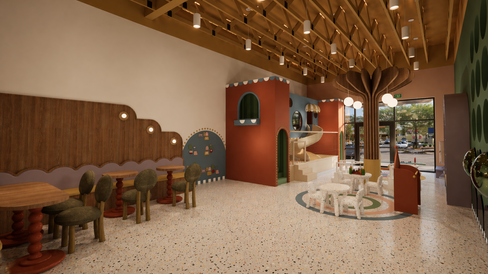


Branding & interior design by House of Form.
For Miney Moe, the goal was never to create a typical children’s brand built around overly polished graphics or predictable “kid-focused” design language. The vision was to bring back the adventurous, imaginative feeling older play places and fast-food interiors once had, spaces that felt exciting, slightly chaotic, and memorable in a way many modern children’s environments no longer do.
From the beginning, the branding and interiors were developed together to feel like one cohesive visual world. The identity system is built almost entirely from simple geometric forms that carry throughout the experience, extending into signage, symbols, play structures, animations, and physical foam blocks children can interact with directly. Typography became another important extension of that thinking. The custom lettering was intentionally designed to feel modular, stackable, and playful, almost like toy pieces or LEGO forms that could be rearranged and rebuilt. Even the animation systems embrace movement and imperfection, creating moments that feel energetic, carefree, and intentionally unserious.
The project also pushed against traditional design “rules” often associated with children’s spaces. Rather than relying on conventional visual language, the identity embraces contrast, color, and unexpected pairings to create something more emotionally distinct while still feeling cohesive at its core. While the experience feels highly playful and spontaneous, the system itself is deeply intentional. Repetition, geometry, and structure quietly organize the identity beneath the whimsy, creating a brand that feels transportive without becoming visually overwhelming. The result is a world-driven identity that feels adventurous, imaginative, and emotionally memorable for both children and parents alike.
Branding Insight
The most memorable experiential brands aren’t afraid to feel playful or unexpected.
When branding and interiors are developed together, even simple shapes and systems can become part of how people physically experience and remember a space.
MAGDALEÑA
Steakhouse Restaurant


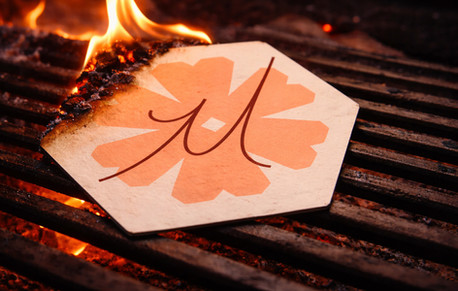
Branding & interior design by House of Form.
For Magdaleña, the branding began by questioning many of the assumptions traditionally tied to the steakhouse category. Instead of building from familiar references, the goal was to create something more emotionally layered, welcoming, and distinct on its own terms. The experience was intentionally designed to feel refined without intimidation, especially for women and guests who may not typically feel drawn to the traditional steakhouse atmosphere. That direction naturally led the concept toward the idea of fire. After introducing the tilde over the “ñ,” the team discovered “leña” translates to firewood in Spanish, which quickly became a central conceptual anchor throughout the branding system. The custom script typography was then hand-drawn to resemble rising flames, stretched upward with sharp points that feel expressive and fierce while still maintaining elegance and gentleness at the same time.
From there, the challenge became introducing femininity without relying on expected visual cues. Instead, it was woven into the experience more subtly. Branding and interiors were developed closely together throughout the project, with the flower symbol directly referencing the same sharp notches and geometry found within the custom millwork and spatial detailing of the restaurant itself. That same thinking extended into the guest experience. Originally developed as a custom cattle-brand-style mark unique to Magdaleña, the branding iron symbol now appears throughout plating details, ceramics, and other intentional moments across the restaurant. “Legit Latin,” emerged as a tagline rooted in the client’s commitment to keeping the experience deeply authentic to Latin culture without feeling commercialized or performative.
At the same time, functionality remained just as important as storytelling. A custom proprietary menu platform was also developed to allow the restaurant team to easily update menus and wine offerings internally as needed while maintaining a cohesive branded experience across every touchpoint. The result is a concept that feels expressive, welcoming, and culturally grounded, offering a different perspective on what a modern steakhouse can be.
Branding Insight
The most memorable hospitality brands today aren’t built around category clichés.
They’re built around making more people feel like they belong in the experience.
RIELLE'DIO
Gallery and Art Studio


Branding & web design by House of Form.
For Rielle’dio, the branding process centered less around creating a perfectly polished artist identity and more around building a creative system that could evolve naturally over time. The goal was to preserve instinct, experimentation, and authorship rather than over-refine them out of the experience.
That thinking shaped the visual language from the beginning. Scribbled typography, crossed-out details, layered textures, and expressive gestures were intentionally embraced to create what was described as “artistic austerity”, balancing crispness and restraint with spontaneity and imperfection. The brand was meant to feel collected, intuitive, and slightly improvised rather than overly controlled. The naming process itself became part of the identity story. Originally operating under her own name, the concept evolved organically through physically scribbling portions of the name out until arriving at “Rielle’dio,” a version that immediately carried a more elevated, European, and fashion-oriented feeling. That sense of experimentation continued throughout the branding system itself.
A large part of the process also focused on building tools that would allow the artist to continue evolving the brand independently. Custom Photoshop treatments, digital brush systems, and flexible visual frameworks were developed so imagery, sketches, and layered expressive marks could remain cohesive while still feeling fluid and instinctive over time.
That same layered approach carried into the symbolism throughout the project. The custom logo mark combines a capital “R” and lowercase “d,” reading almost like a squiggle contained within a square. That same symbol continued into sterling silver artist signatures and jewelry-inspired studies influenced by Native silversmithing traditions connected to Gabrielle’s personal history. The result is a brand that feels expressive, evolving, and deeply personal. Designed less around perfection and more around preserving creative freedom within a cohesive visual world
Branding Insight
The best creative identities leave room for evolution.
A brand should feel cohesive without limiting the person behind it.
SUPPLY & SIP
Cafe & Lifestyle Brand
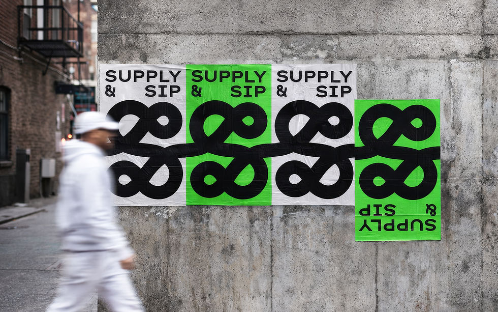


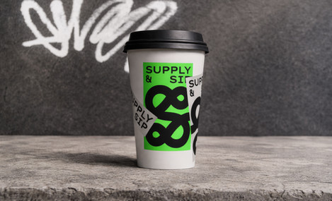


Branding & design by House of Form.
For Supply & Sip, our focus centered entirely around developing a branding system rooted in connection, interaction, and community. The client was adamant about the space feeling grounded in ongoing relationships and creative exchange, which naturally led the ampersand to become the conceptual anchor of the identity itself. Designed to feel infinite, constantly looping and continuing, the mark represents the movement, conversations, and interactions happening within the café.
Rather than creating a brand people simply observe, the goal was to build one people actively participate in. Through tracing guides, graffiti-style poster systems, and interactive moments woven throughout the experience, guests are intentionally invited to engage with the identity itself rather than passively consume it. That same thinking shaped the visual language throughout the system. Neon green became a core brand color not only because matcha is central to the café experience, but because the color already exists heavily throughout industrial materials and manufacturing. Instead of avoiding those references, the project intentionally repurposes them into something elevated, creative, and unexpected. Throughout the branding, the team leaned into materials and applications many agencies would typically move away from, including industrial greens, Mylar, graffiti-style layering, and existing print systems already available at scale. The approach became less about over-customizing every element and more about finding overlooked materials and systems “hiding under our noses” and reintroducing them in a more intentional way.
That same balance between creativity and practicality shaped the packaging system as well. Rather than relying on fully custom packaging, the team developed an adaptable sticker system that could scale across cups, bags, and collateral while still maintaining a cohesive identity. Intentional imperfections became another important part of the project. A large gap built directly into the logo initially feels visually incorrect at first glance, but was designed specifically to create curiosity, interaction, and memorability, embracing the kinds of human decisions that increasingly stand out in a world of repetitive, AI-generated branding. The result is a café identity that feels connected, local, and deeply tied to Roosevelt Row’s creative energy.
Branding Insight
Strong branding doesn’t stop at recognition.
The most memorable identities create interaction, allowing people to physically engage with the brand rather than simply observe it.
At House of Form, we believe the strongest brands are built through cumulative experience rather than singular gestures. Often, the details shaping the deepest connection are the ones people don’t consciously notice at all, but continue to remember long after the experience ends.


